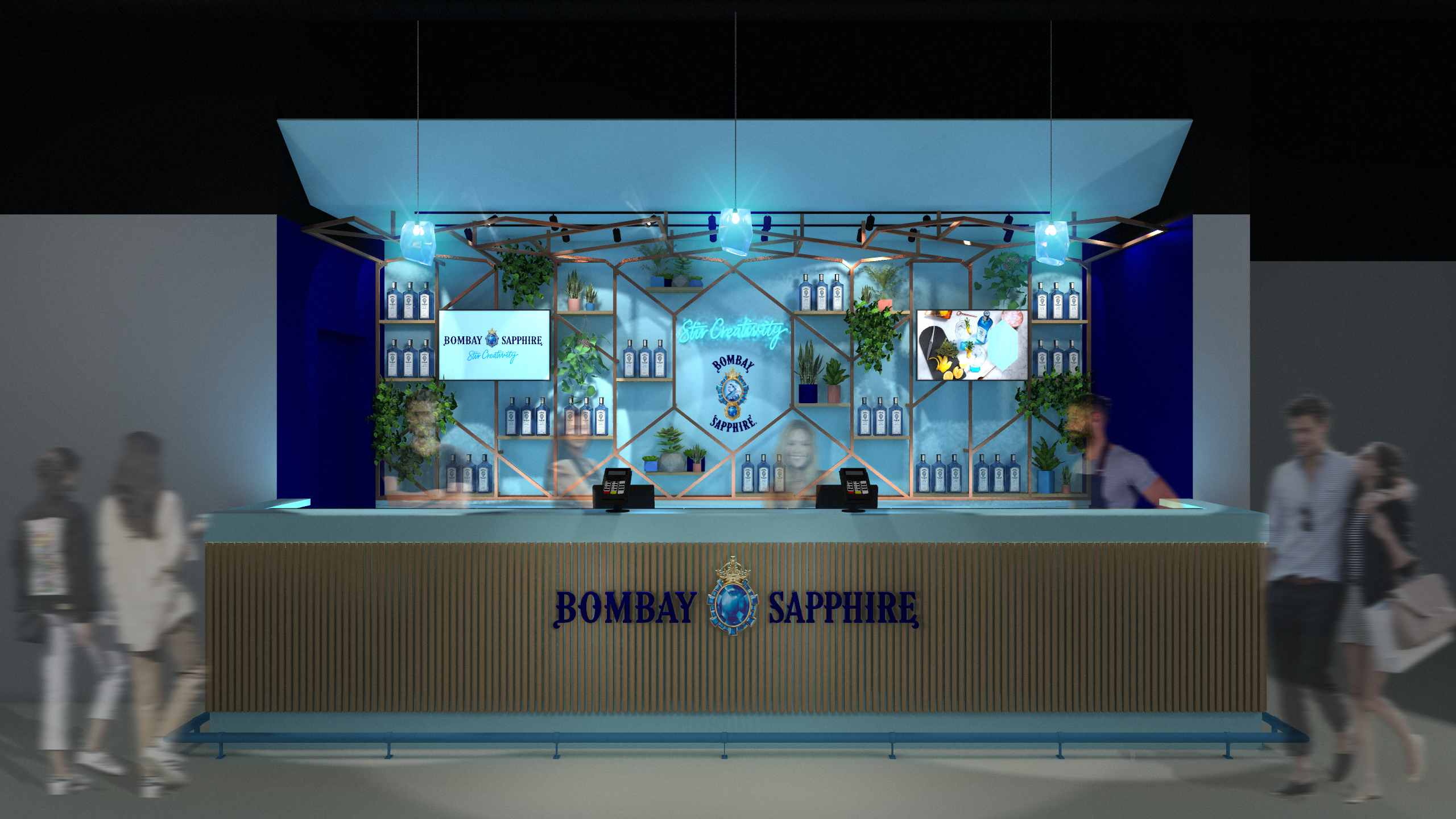
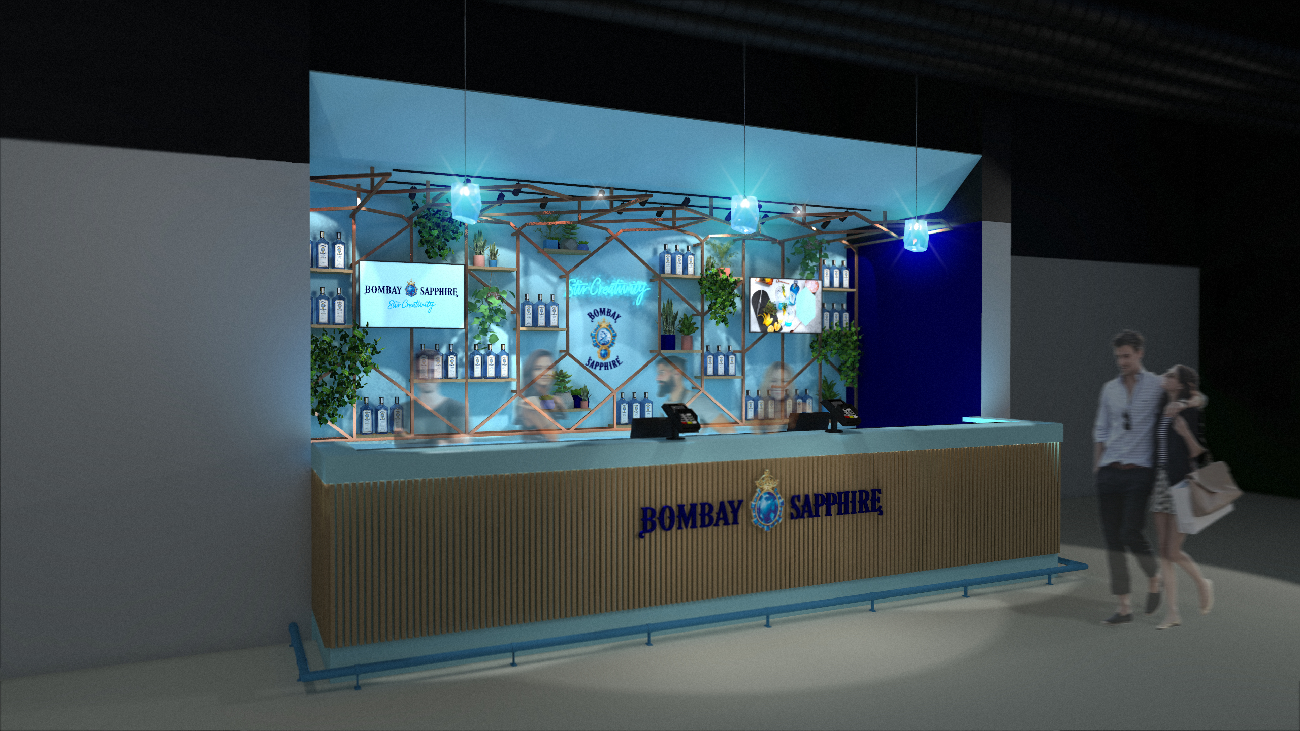
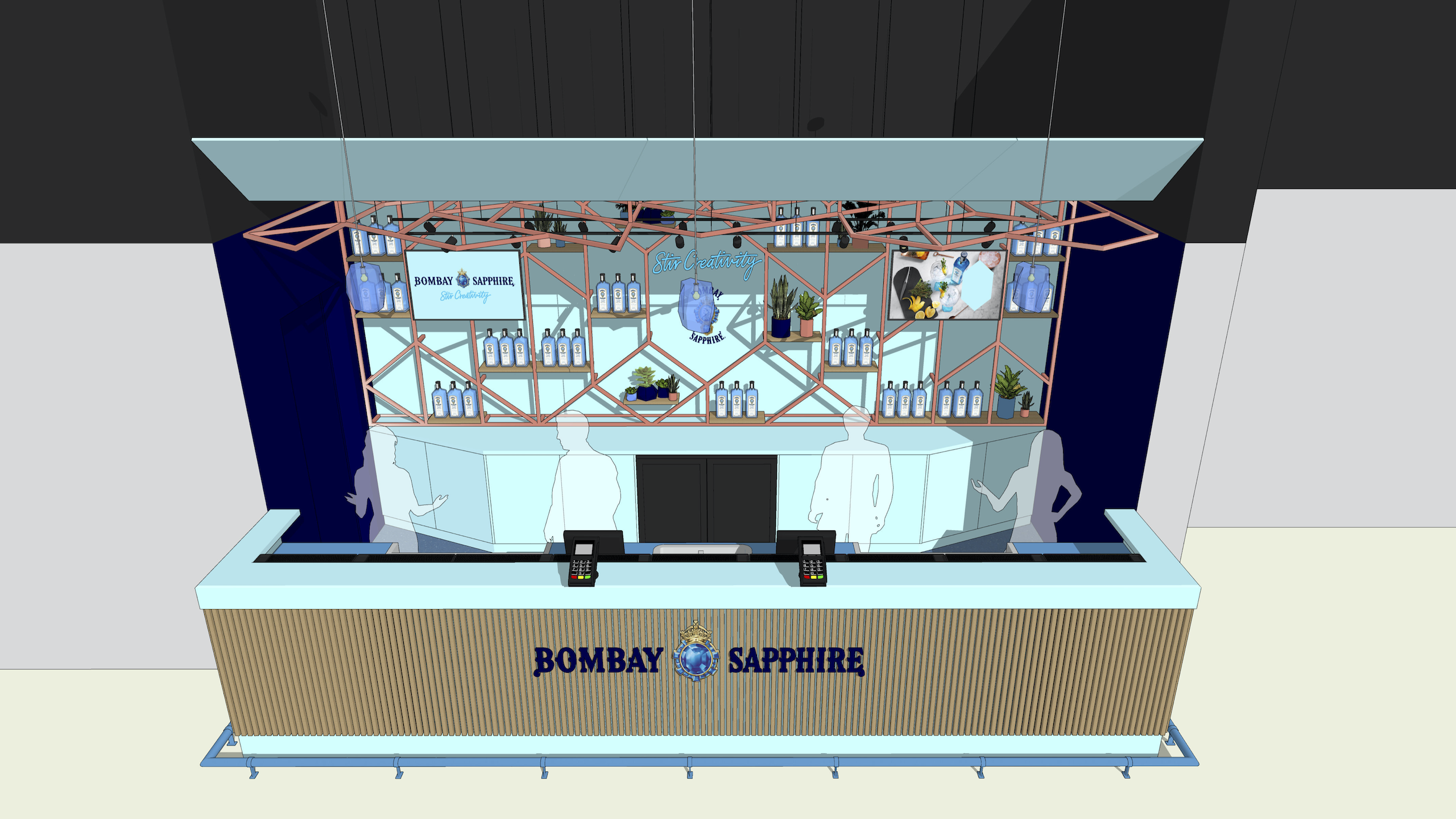
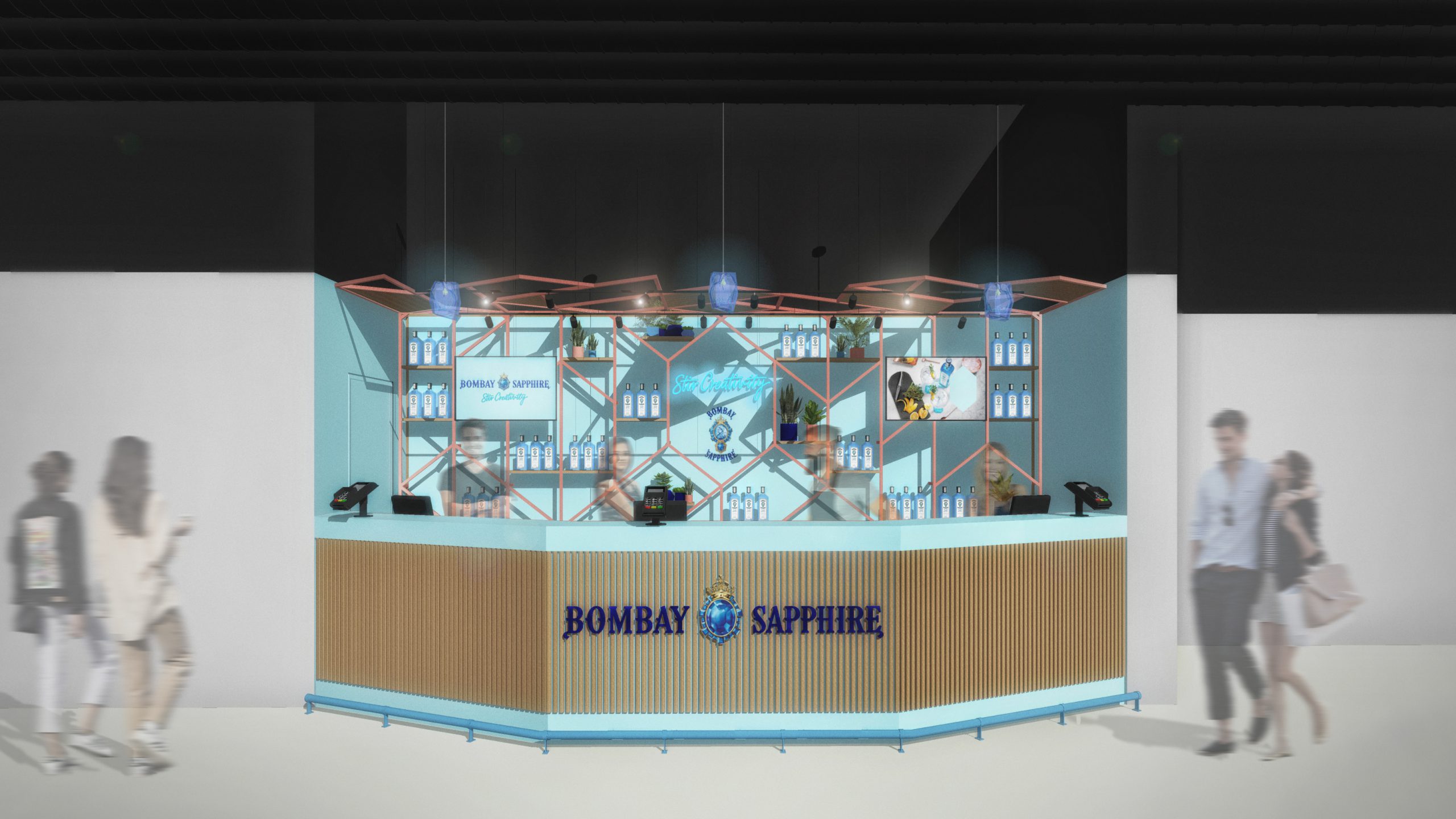
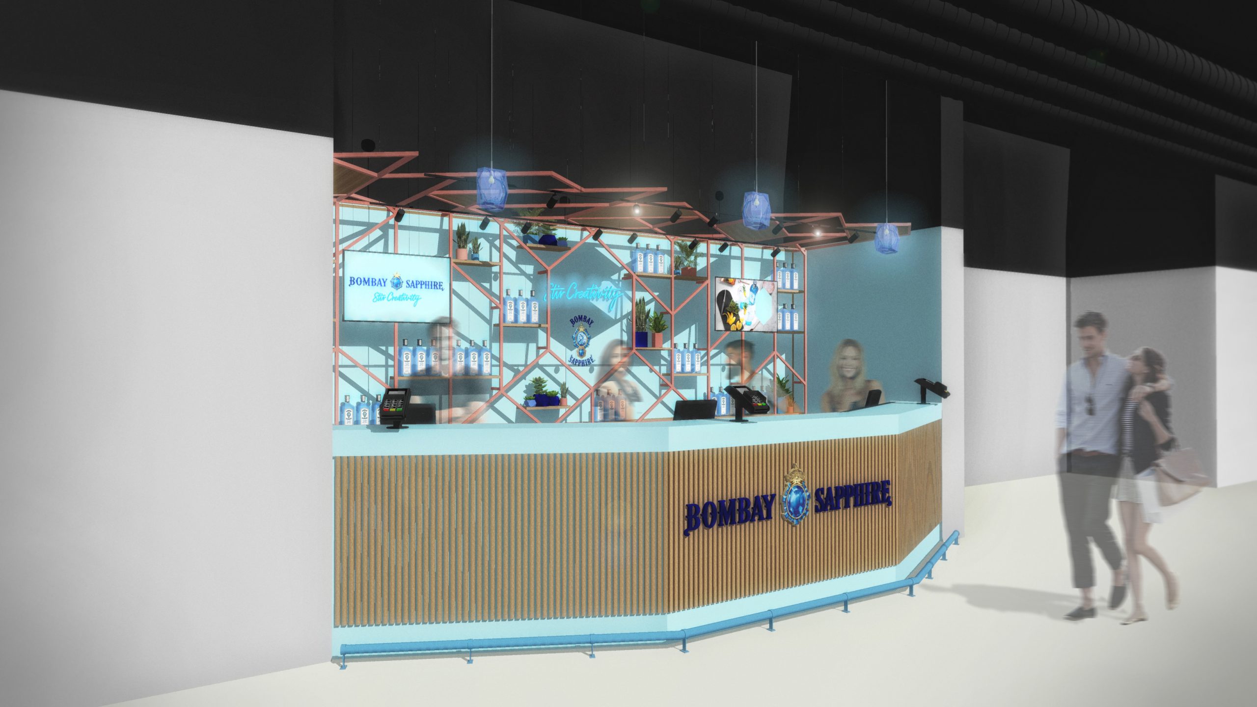
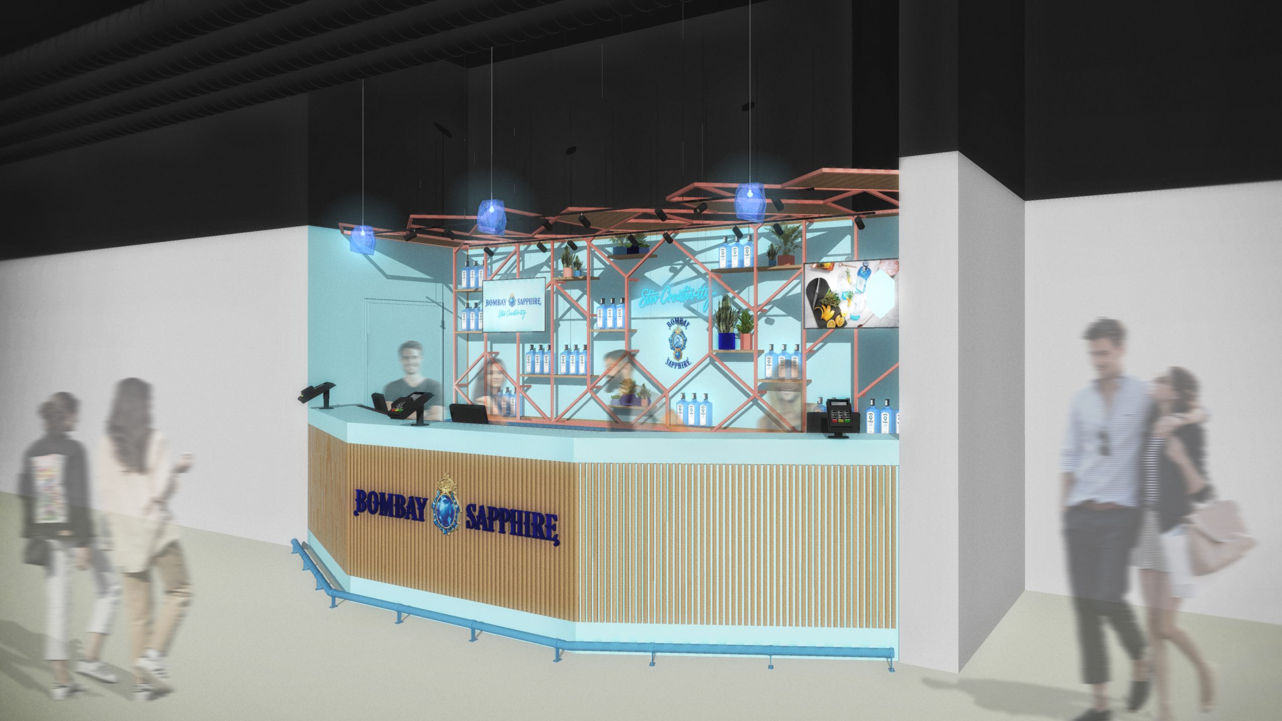
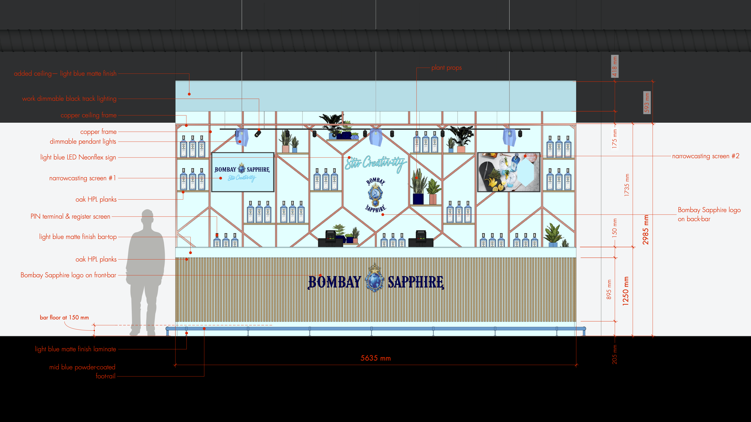
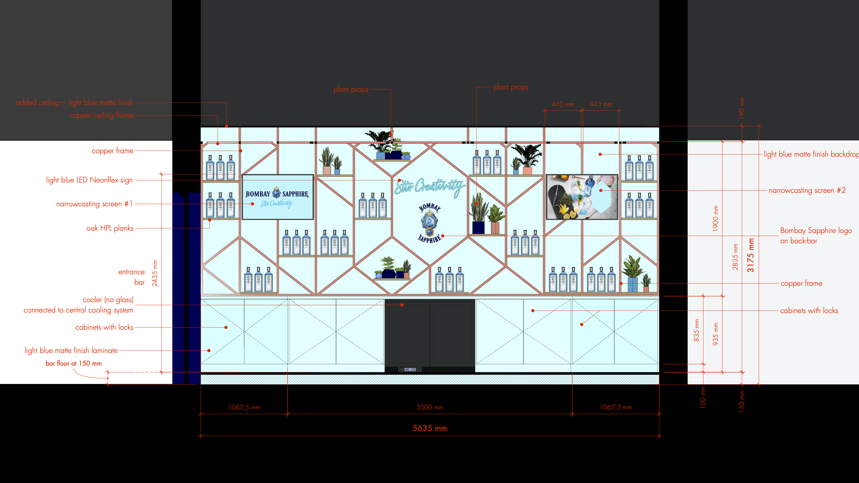
The challenge here was the spatial implementation of Bombay Sapphire’s newly introduced identity. Its new brand guide provided with plenty theoretical examples, which hadn’t been introduced at the time.
Bombay’s new well thought out identity is the very heart of this bar design. The new hexagonal grid form, the various kinds of blue and the new pay-off “Stir Creativity” play a significant role in creating a spatial and truly experiential branded bar.
Due to Bombay’s previously unimplemented design principles, Ziggo Dome’s own guidelines and a very tight budget, the design had to be revised and approved every step of the way.
The above, resulted in an authentic spatial expression of Bombay’s core values instilled into a highly functional eye-catcher of a bar.
Preliminary & definitive design.
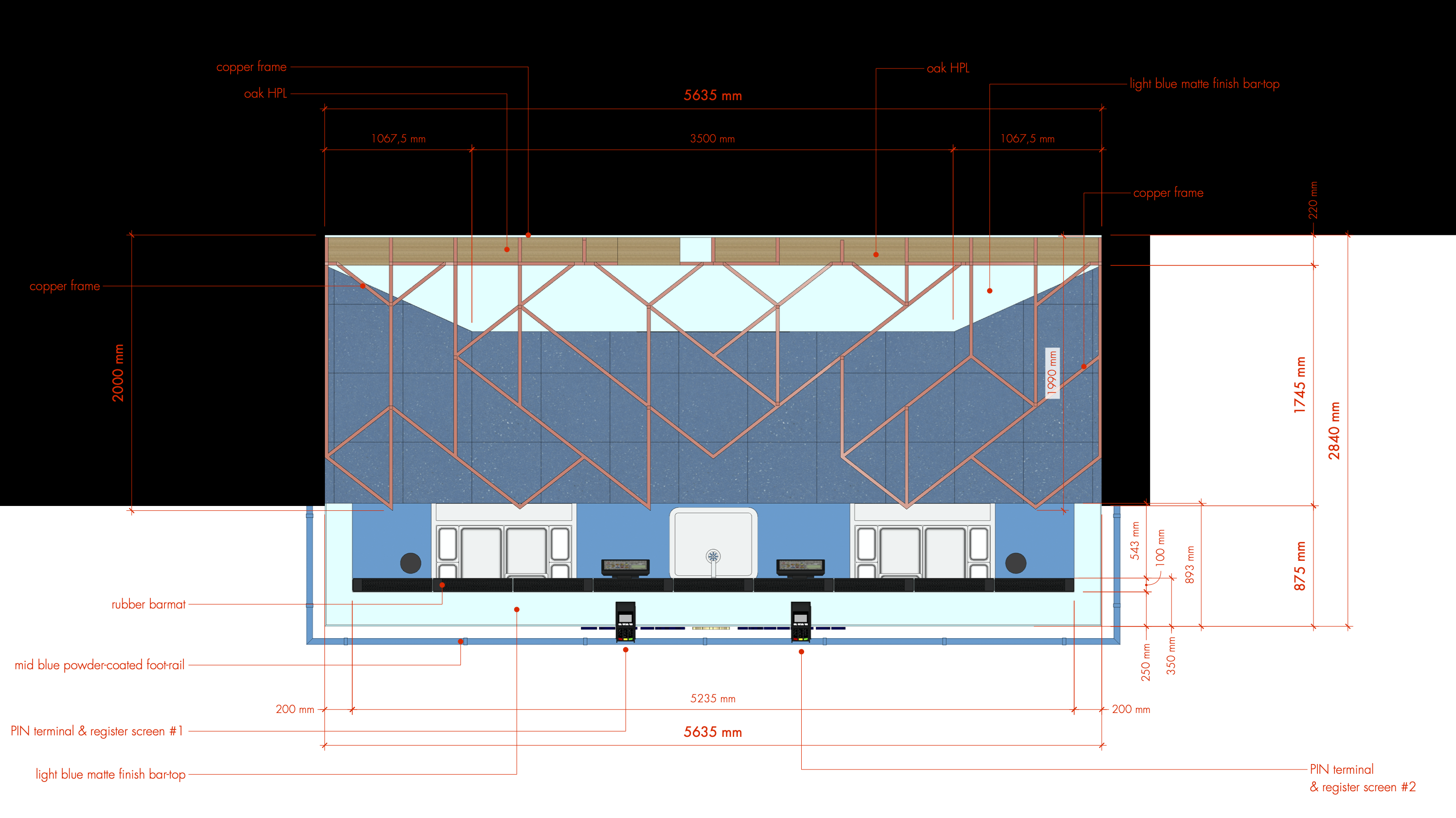
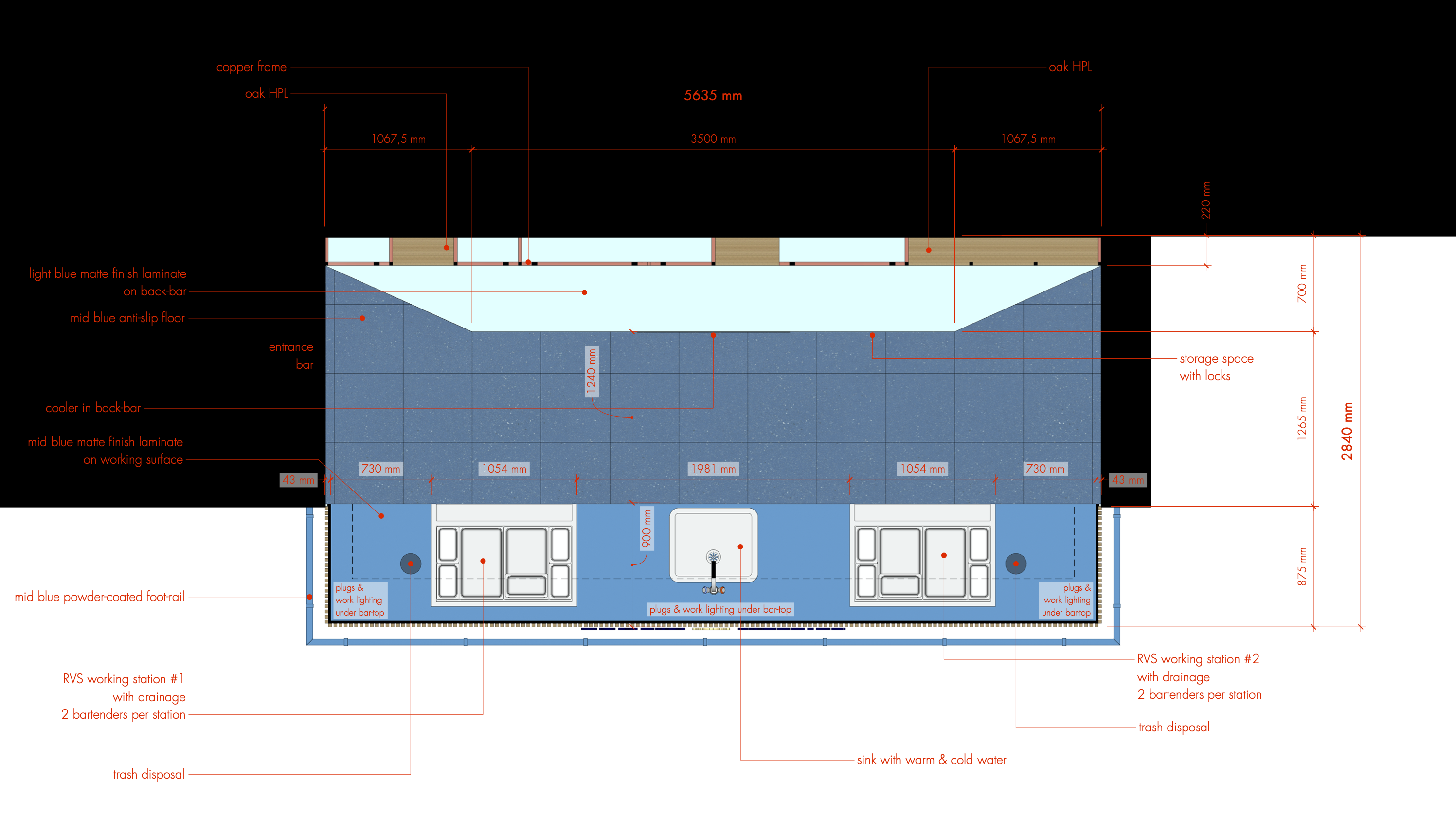
3D design. 2D design. Construction & detailing drawings. Presentation material preparation.
